Two Doughboy Square
As seen in GB+D Magazine:
When Desmone Architects decided to expand its offices, employee well-being was a top priority. Working out of an 8,200-square-foot restored 1902 bank building, Two Doughboy Square adds 25,000 square feet of space for the growing architecture firm. The three-story building consists of garage space, a studio, and an upper level that is leased to another tenant. Designed with employee health and comfort in mind, it is one of the first projects in the region to receive a WELL Gold certificate.
The Neighborhood
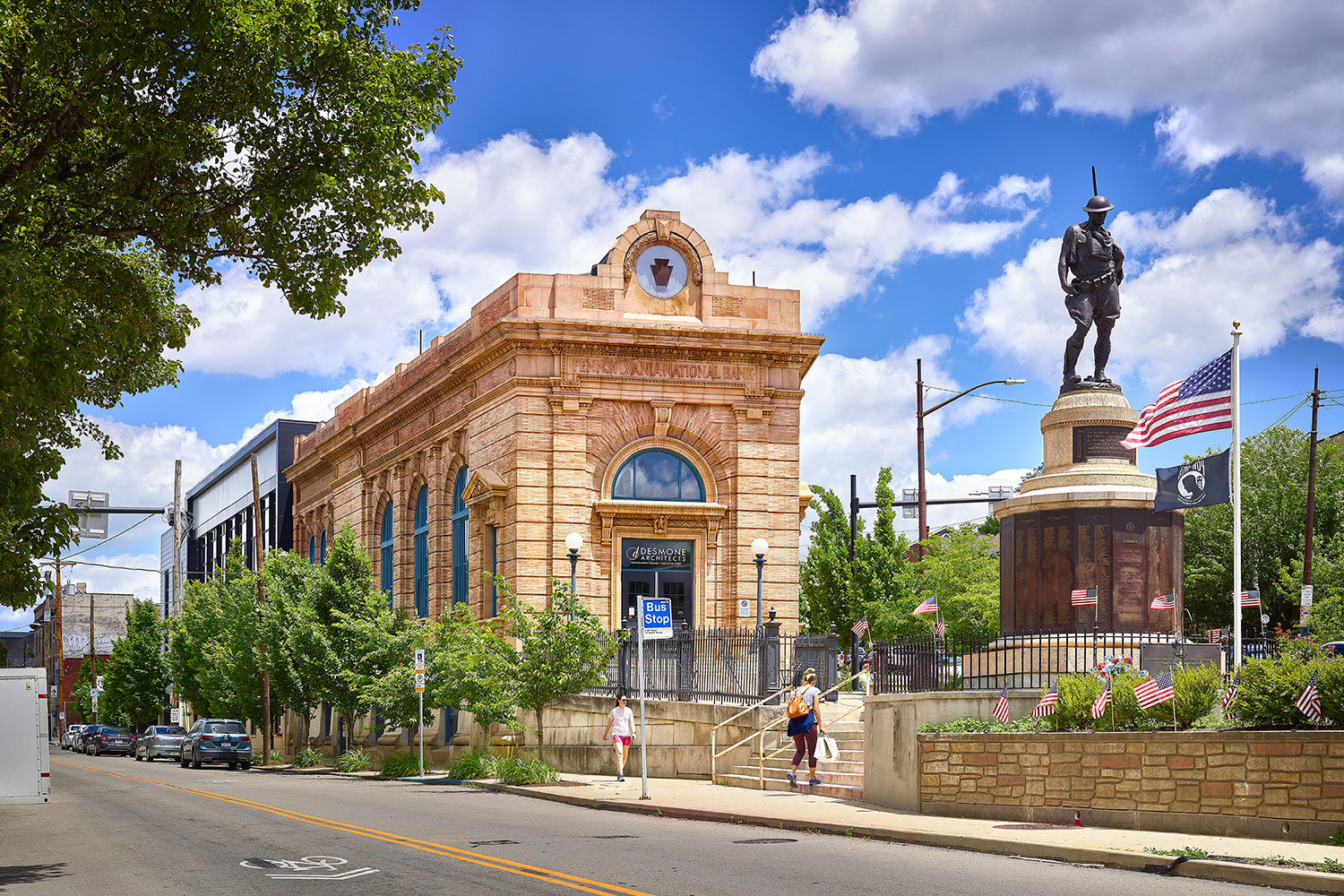
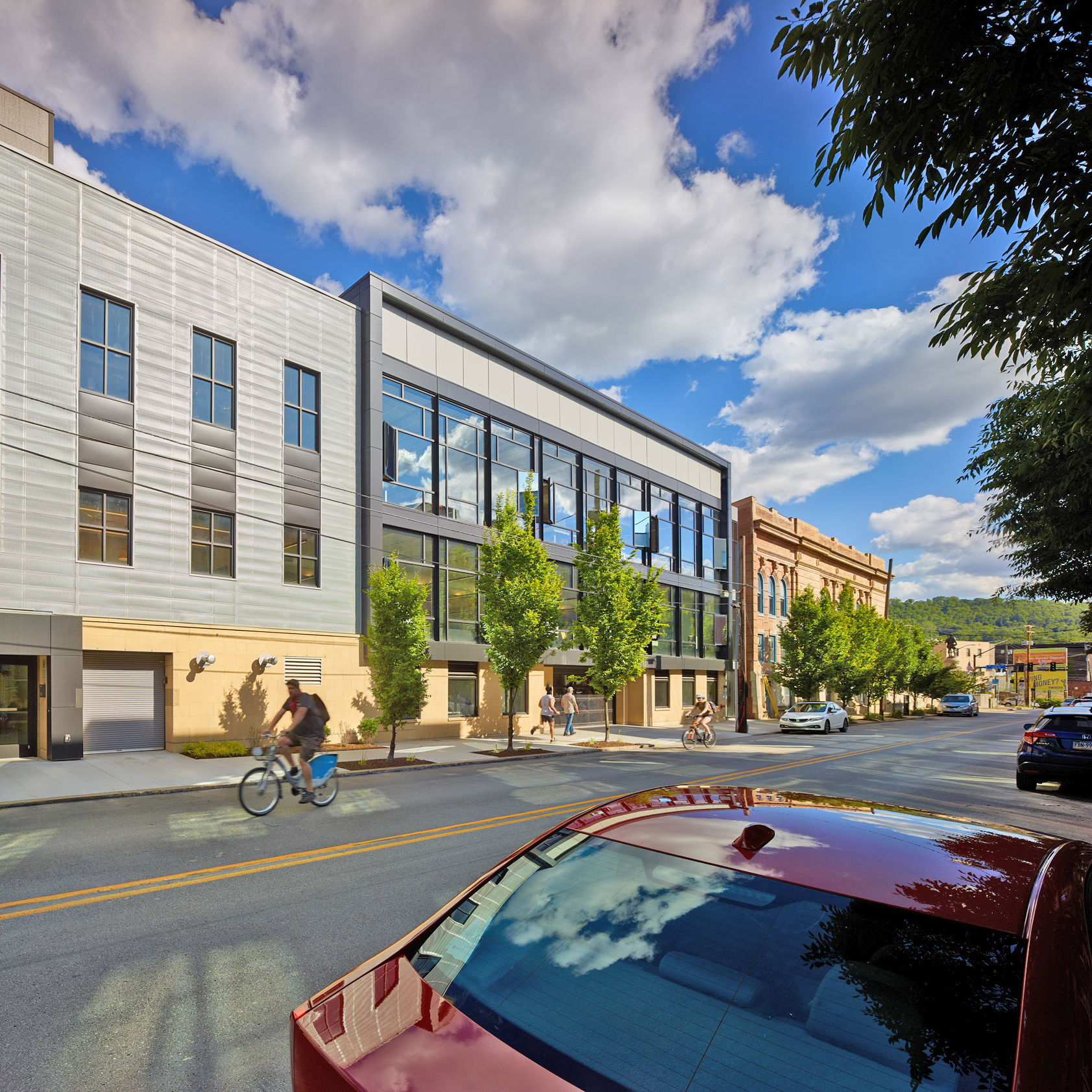
Desmone Architects’ offices are located at Doughboy Square, named after the statue of a World War I soldier. Photo by Ed Massery
Desmone Architects moved into their Pittsburgh office in the trendy, riverfront Lawrenceville neighborhood in 1993. The team of five took over a bank building slated for demolition and renovated it. Over the years, Lawrenceville has become more and more popular with thriving retail and nightlife. “Our office has been instrumental with what I truly believe is the development and reclamation of this neighborhood,” Desmone associate Terry Oden says. “That’s one thing we take great great pride in. I joke that I only work on projects a quarter-mile from the office.”
Meanwhile, by the late 2010s, the Desmone team had grown to about 40 people and needed more office space.
The Challenge
The architects were tasked with designing an addition that offered functional office space to employees while showcasing what the firm is capable of to visitors. The old bank building sits at a Y-shaped intersection of two major roads. With the commercial neighborhood to the north and residential neighborhood to the south, the architects had to find a way to balance different aesthetics.
WELL Gold
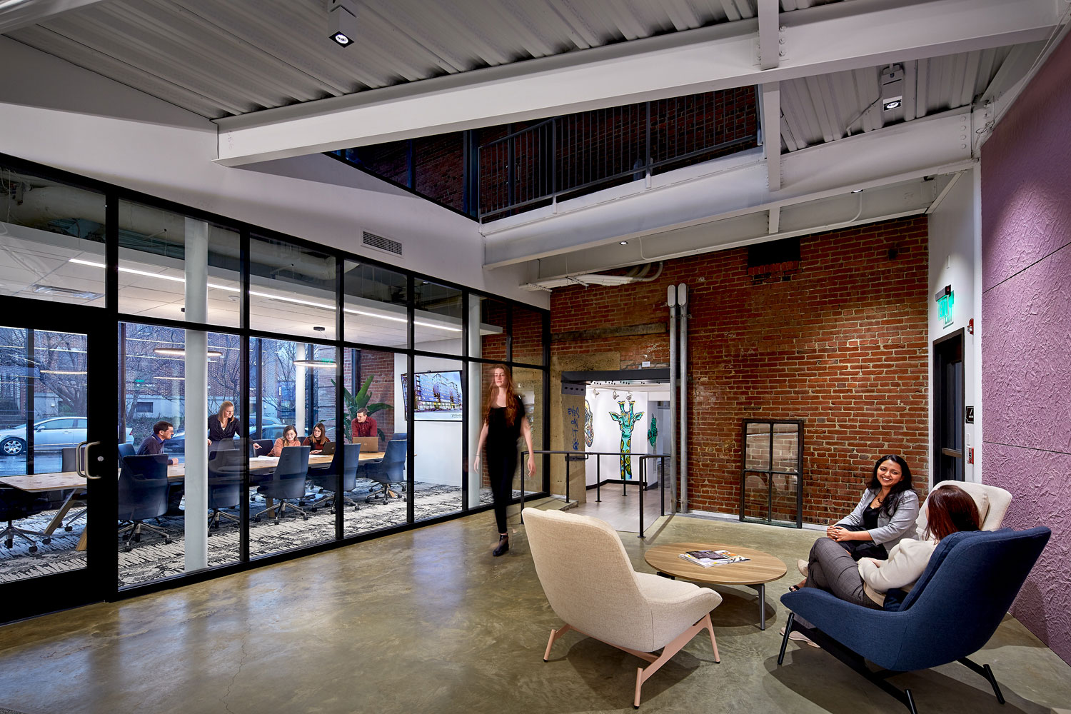
The Two Doughboy Square addition includes a conference room with floor-to-ceiling windows. Photo by Ed Massery
Desmone committed to following WELL standards because it puts occupant health and safety at the forefront. Oden says the pandemic made it even more clear why it’s important. As the project manager for Two Doughboy Square, he says he finds it interesting that WELL looks at buildings through the lens of different body systems—like the circulatory system and nervous system—and the ways they are linked.
The Facade
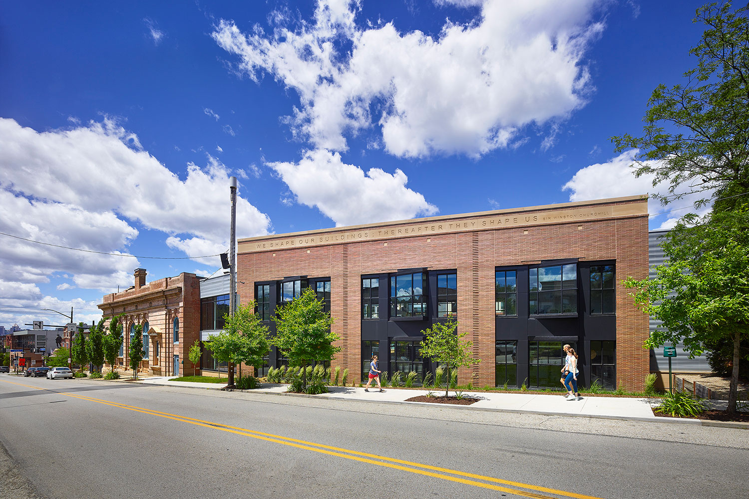
The quote “We shape our buildings; thereafter they shape us” is inscribed in the south-facing side of the addition. Photo by Ed Massery
Sitting at a triangular intersection between a commercial and residential district, the facade on the north and south sides looks very distinct. The south facade uses Roman bricks to match the old bank building. The bay windows nod to the residential neighborhood to the south side of the project.
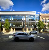
The north facade uses a YKK AP curtain wall with black mullions. This creates a modern look that fits well with the commercial district on the north side. The storefront windows on street level allow the firm to showcase their projects.
Lighting
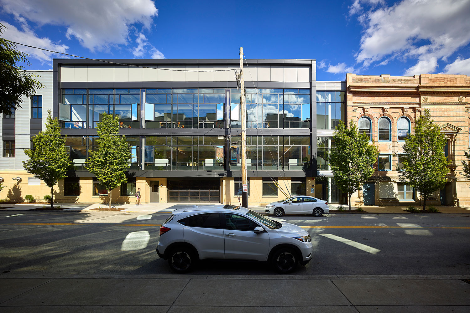
The north facade of the addition includes a curtain wall with mirror and smoked glass windows. Photo by Ed Massery
The large windows throughout the building bring in lots of natural light. Natural light not only helps with energy savings by reducing the need for artificial lights, it also flows with the body’s circadian rhythm. About 75% of regularly occupied spaces have direct access to natural light.
The team was challenged with providing adequate lighting while reducing glare and other unpleasant effects of excess light. The architects worked with YKK AP to create optimal lighting conditions. For example, vertical fins were added on the curtain wall windows to control the light.
Thermal
The various YKK AP window systems used also reduce heat transfer. This is vital to keeping the interior warm in an energy-efficient way during the Pittsburgh winter. The north and south side windows were treated differently to account for differences in the sun on the two sides.
Physical and Mental Health
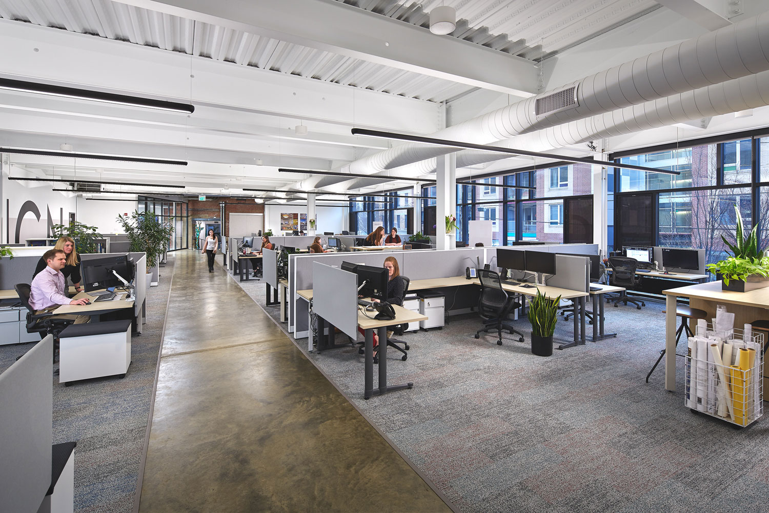
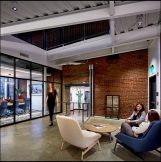
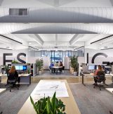
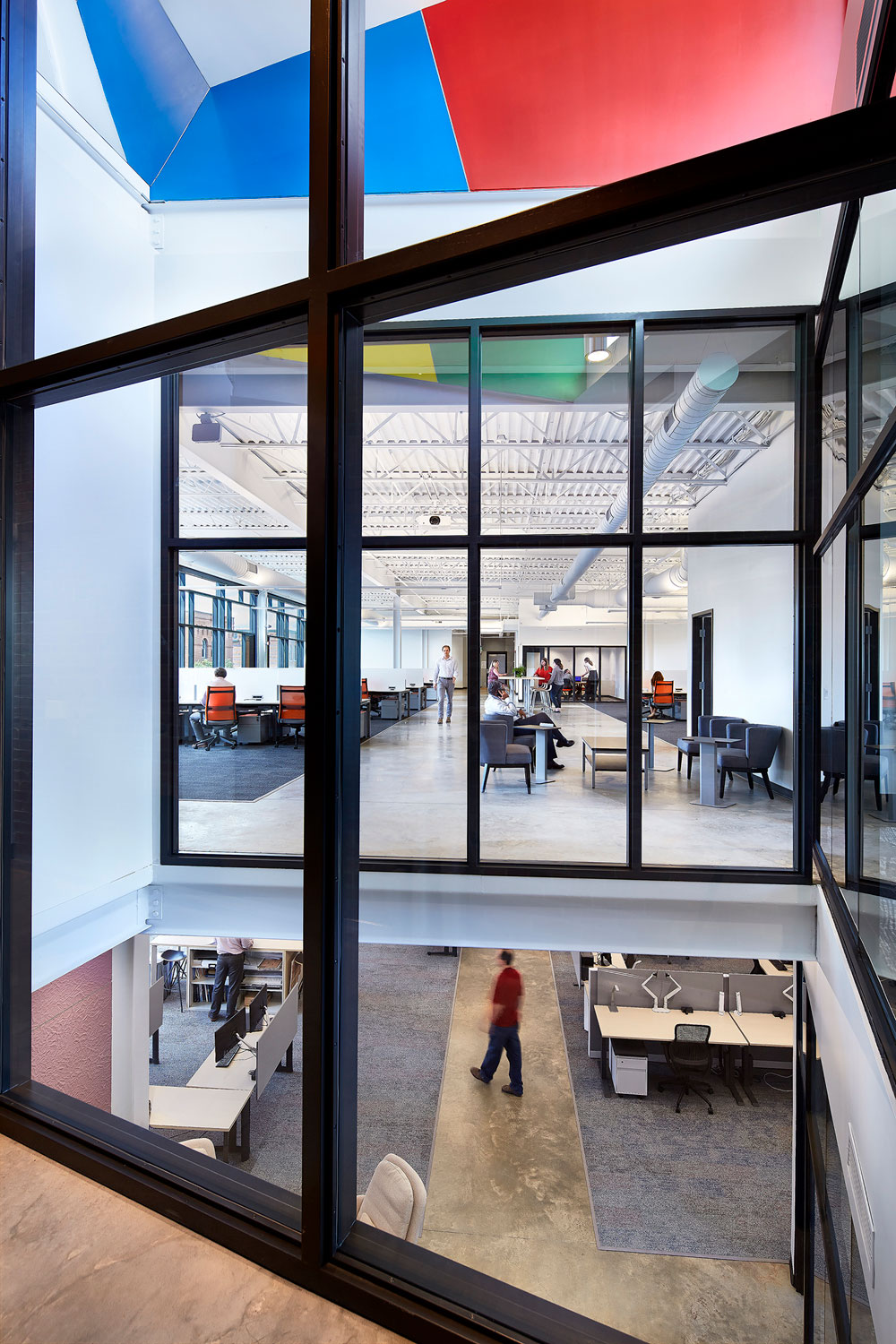
Inside Desmone’s new studio at Two Doughboy Square. Photo by Ed Massery
To maintain air quality, low VOC materials are used throughout the building. Building entrances are designed to limit incoming pollutants. Water quality is tested regularly.
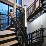
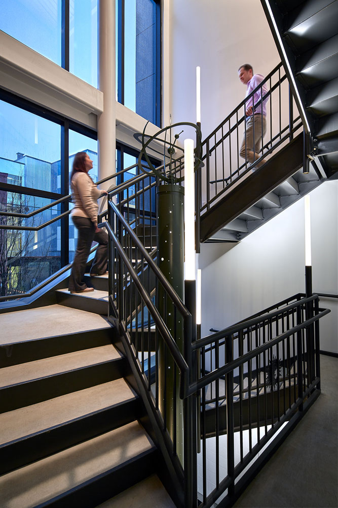
Physical and mental well-being are also emphasized. For example, the stairs were designed to encourage more movement. “We could have done this with the 44-inch code minimum, but being a wider staircase, it makes it more inviting for people to sit, hang out, and traverse up and down,” Oden says.
Details
- A skylight in the “wedge” of the addition is like a periscope. “It has a mirror that lets you look and see the earth meeting the sky,” says Oden. “We wanted that visual connection to let light in the darkest portion of the space.” Photo by Ed Massery
- Oden designed a sculpture called Escape from Atmosphere depicting space shuttles and celestial objects. The sculpture was designed specifically for the space and works with the building’s structural supports. Photo by Ed Massery
Oden and the rest of the team added personal touches to make the space their own. For example, they display souvenirs of famous structures—including a part of the Berlin Wall, a reclaimed brick from Frank Lloyd Wright’s Martin House, and pieces from the demolished Three Rivers Stadium in Pittsburgh.
Oden says it feels fantastic to work in the place that he’s helped to create. “We’re always talking about the metrics, and you spend additional money [making it WELL-certified],” he says. But, he says it has paid off. “We get a tremendous amount of compliments here. It feels like a great place.”
